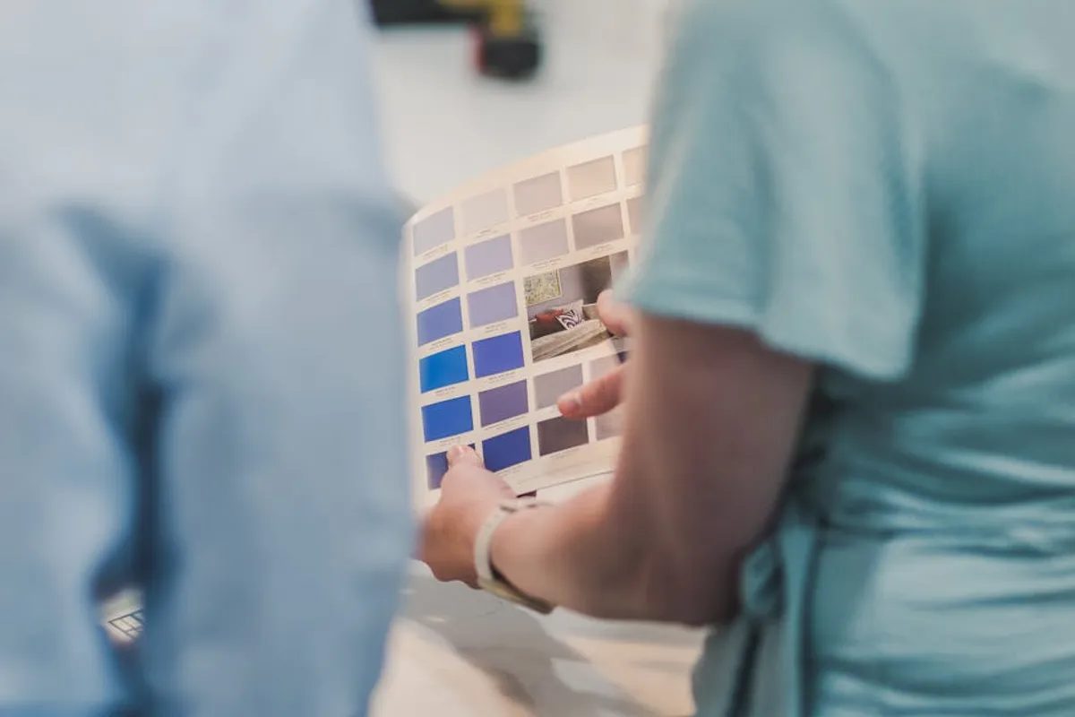
Sherwin Williams' "Upward" (SW 6239) represents a specific choice for those seeking a serene, adaptable blue. As a designated Color of the Year, its selection indicates a trend toward calming, yet sophisticated, interior palettes. This color is not a neutral, but it functions with a similar versatility, offering a soft, airy quality that can both anchor and brighten a space. Understanding its precise characteristics and how it interacts with light and other elements is crucial for successful application, particularly when aiming for a specific emotional or aesthetic outcome in residential or commercial settings.
Understanding Sherwin Williams Upward (SW 6239)
Color Profile and Undertones
Upward is best described as a light, airy blue with distinct gray undertones. This gray component prevents it from appearing overly vibrant or childish, lending it a mature, sophisticated quality. Depending on the lighting conditions and surrounding colors, Upward can subtly shift. In rooms with abundant natural light, particularly northern exposure, its blue notes are more pronounced, presenting a crisp, clean appearance. In warmer artificial light or rooms with southern exposure, the gray undertones become more evident, grounding the color and preventing it from feeling cold. Some observers detect a very faint violet or green whisper, which contributes to its complex, nuanced character rather than defining it.
Light Reflectance Value (LRV)
Sherwin Williams Upward has a Light Reflectance Value (LRV) of 57. LRV measures the percentage of light a color reflects. A value of 0 is absolute black, and 100 is absolute white. At 57, Upward falls into the mid-range, indicating it is a moderately reflective color. This LRV means it will reflect a fair amount of light, helping to make a room feel brighter and more open than a darker shade, but it is not so high as to feel stark or sterile like a pure white. Its mid-range LRV makes it suitable for various room sizes and light conditions, as it can both lighten a space and provide a sense of depth without overwhelming it.
Strategic Room Applications for Upward
Living Spaces
In living rooms, Upward contributes to a relaxed and inviting atmosphere. Its soft blue-gray tone pairs effectively with natural wood furniture, linen textiles, and woven accents, fostering a connection to the outdoors. It serves as a gentle backdrop for artwork or bolder decorative elements without competing for attention.
Best for: Creating a calm, expansive feel in open-concept living areas or traditional sitting rooms.
Bedrooms
Upward's serene quality makes it a strong choice for bedrooms. It promotes a sense of tranquility conducive to rest and relaxation. Pairing it with crisp white trim, soft off-white bedding, and muted accent colors like sage green or dusty rose can enhance the calming effect. The color maintains its soothing presence whether used on all walls or as an accent.
Best for: Establishing a peaceful, restorative sanctuary.
Bathrooms
The clean, fresh attributes of Upward translate well into bathrooms, where it can evoke a spa-like ambiance. It complements white porcelain fixtures, polished chrome, or brushed nickel hardware. For a more organic feel, consider pairing it with natural stone tiles or light wood vanities. Its moderately reflective nature helps brighten smaller bathrooms without making them feel clinical.
Best for: Achieving a clean, refreshing, and tranquil bathroom environment.
Home Offices and Studies
For workspaces, Upward offers a subtle yet effective environment for concentration. Its non-distracting hue can help reduce visual clutter and promote focus. When combined with functional furniture in dark wood or metallic finishes, it provides a sophisticated and productive setting.
Best for: Supporting focus and clarity in a home office or study.
Kitchens
While less common than neutrals, Upward can be a distinctive choice for kitchen walls or even cabinetry. On walls, it provides a cool counterpoint to warm wood tones or stainless steel appliances. For cabinetry, it offers a sophisticated alternative to traditional white or gray, especially when paired with white quartz countertops and brass hardware for a contemporary look.
Best for: Adding a fresh, modern touch to kitchen walls or lower cabinetry.
Complementary Color Palettes and Materials
The versatility of Sherwin Williams Upward allows for several effective pairings:
- Warm Neutrals: Off-whites (e.g., Sherwin Williams Pure White, Alabaster), light beiges, and soft creams provide a gentle contrast, preventing the space from feeling too cool.
- Deep Blues and Greens: For accent elements or adjacent rooms, deeper blues (like navy) or muted greens (like olive or sage) can add depth and sophistication without clashing.
- Natural Materials: Wood tones (light oak, walnut), woven textures (jute, rattan), and natural stone (marble, limestone) enhance Upward's organic appeal.
- Metallic Finishes: Brushed brass or gold accents introduce warmth and a touch of luxury, while polished chrome or brushed nickel maintain a crisp, modern aesthetic.
- Soft Pinks and Corals: For a more playful or feminine touch, very subtle hints of blush pink or soft coral can introduce warmth and vibrancy.
Pro Tip: Always observe a paint sample of Sherwin Williams Upward on a large board in your intended space for at least 24-48 hours. Assess how it appears under natural light throughout the day and with artificial lighting at night. Lighting conditions, existing flooring, and furniture can significantly alter how the color presents itself, revealing undertones not immediately apparent on a small swatch.
Making Your Decision with Upward
Selecting Sherwin Williams Upward for a project involves more than just liking the color on a chip. Consider the fixed elements in your space, such as flooring, trim color, and existing cabinetry. Upward's cool undertones can either harmonize with or highlight warmer wood tones. Evaluate the primary function of the room; its calming effect is ideal for relaxation, while its clarity can support focus. Finally, remember that the size of the room and the amount of natural light it receives will dictate how light or deep Upward appears, influencing the overall mood and perception of space.
Frequently Asked Questions About Sherwin Williams Upward
Is Upward a warm or cool color?
Sherwin Williams Upward is predominantly a cool color. Its base is a soft blue with significant gray undertones, which gives it a calming and refreshing quality. While it can appear slightly warmer in certain lighting conditions (e.g., rooms with southern exposure or warm artificial light), its inherent character leans cool.
What colors pair well with Upward?
Upward pairs effectively with warm neutrals like off-whites (e.g., SW Pure White), light beiges, and creams. For accent colors, consider deeper blues, muted greens (like sage), soft pinks, or even subtle corals. Natural wood tones and metallic finishes such as brushed brass or polished chrome also complement its aesthetic.
Is Upward suitable for small rooms?
Yes, Upward is suitable for small rooms. Its LRV of 57 means it reflects a moderate amount of light, which can help small spaces feel more open and airy without appearing stark. The soft blue-gray tone also contributes to a sense of expansiveness and calm, rather than making the room feel enclosed.
What is the LRV of Sherwin Williams Upward?
The Light Reflectance Value (LRV) of Sherwin Williams Upward (SW 6239) is 57. This indicates it is a moderately reflective color, capable of brightening a space while still providing a noticeable color presence.